Edenwaith Blog
29th August 2018 | Programming
Recently at my job the macOS Calendar has been having problems properly syncing with the Exchange server, likely due to a corrupt attachment. I came across this post by Michael Kummer detailing the steps to resolve the problem I had encountered. I went through all of the listed steps and it corrected the problem. Calendar resynced itself and the annoying warning disappeared.
Well, for a little while, at least.
The problem popped up again. Unfortunately, I haven't determined which particular event is causing the conflict, but for the time being, I had to go through all of the steps again. But if this is liable to happen again, the situation invites itself as an opportunity for a little scripting to simplify the process.
I whipped up the following bash script which performs four steps:
- Quit the Calendar app
- Delete all of the Calendar cache files
- Kill all running processes related to the Calendar
- Restart the Calendar app
Remember to set the executable permission on the script via chmod 755 clear_calendar_cache.sh. To make things even quicker, an alias can be set up in your shell so the script can be quickly run from anywhere in the Terminal.
12th July 2018 | Programming
Out of technical curiosity, I wanted to inspect the internals of an Android app. I'm well acquainted with being able to download and inspect iOS apps on the Mac, so I was interested in how I might be able to perform the same task with an Android app and a Mac. Finding the answer proved to be a little more convoluted than I initially expected.
There are several tools and esoteric methods to try and download an APK to a Mac, but my initial cursory attempt did not meet with immediate success, so I investigated other routes. There are many options to transfer standard files (photos, documents, etc.) to and from an Android device using the venerable Android File Transfer app, but that did not allow the capability to transfer an app from the phone onto the computer.
I was already familiar with using adb to sideload an app onto an Android device, so I figured that the reverse might be a feasible solution. Indeed, this is possible. This took a couple of steps from the command line to copy the apk (named myapp in this example) onto the Mac.
- Get a list of all of the packages available on the device:
adb shell pm list packages
- Search for the identifier of the app you want and run the following command to get its path:
adb shell pm path com.example.myapp
- Finally, copy the apk file to the selected destination on your computer:
adb pull /data/app/com.example.myapp-1/base.apk path/to/destination/
Similar to how an iOS app's ipa file is just a loosely disguised zip file, the same applies to the apk file. One can use a simple command of unzip myapp.apk to dump the contents of the apk file for further inspection. However, some of the files, such as the XML files, might be saved in a binary format, so it is not read as easily as an unencrypted text file. This was a good start, but some further work was needed to be able to more thoroughly explore the package's contents.
Android Studio can also be used to open up an APK, but since I did not have that installed on my laptop, I opted for the recommended tool apktool. However, if you have Android Studio already available, that is the ideal route to take.
I installed a current version of Java and the apktool. Once it was in place, I was able to extract the contents of the APK using the command apktool d myapp-base.apk. This dumps the contents of the apk into a separate folder, making the xml files, assets and other support files readable.
I hope that this small tutorial proves useful for anyone else who is also interested in being able to take an app from an Android device, put it on a computer, and then inspect its contents to see how an app was constructed. Happy exploring!
3rd July 2018 | Programming

I've been thinking a lot about King's Quest lately.
My most recent bout of Sierra nostalgia is likely due to having met a merchant at a comic con selling
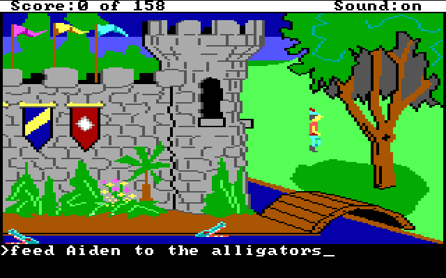
shadowboxes and prints of classic 8-bit games, such as this piece of desktop art of the opening screen from King's Quest 1. Now this scene of verdant greens and waving flags calls out to me on a daily basis, beckoning me to delve deeper and learn its most difficult of secrets. No, not the location of the three treasures or even the name of the gnome (ifnkovhgroghprm), but the secrets of unraveling the Adventure Game Interpreter (AGI).
When King's Quest was first released in 1984, it was quite a progressive game for the time. Although I do not recall the exact details, it is quite possible that the first Sierra game I ever played was the original King's Quest back in the mid-1980s. Even thirty-some years later, I am still ferreting out new secrets from this game (e.g. Zombie Goat, Walk On Water, Walk Through Walls), however my interests now delve deeper than finding interesting quirks and easter eggs.
A couple days ago I was curious if it was possible to reverse engineer AGI, the game engine which ran fourteen of Sierra On-line's games in the 80s. The original game (and its various remakes) have held up fairly well over the years, but there are still a number of fun "what-if" type of ideas I would love to implement in the AGI version of the game. While I am not interested in recreating the entire game, I think it would be a fun exercise to be able to hack the game and make some custom edits to further build upon the 8-bit realm of Daventry.
One quick Google search revealed that there are quite a few resources on creating your own AGI game or inspecting original game resources. Many of the references and tools date back to the late 90s, but some of the content is still quite useful. One of the most interesting things I came across was Barry Harmsen's presentation Reverse Engineering 80s Sierra AGI Games. You can see the results of Barry's magnificent digital spelunking at the Twitter account @agistuff. Barry has written a number of Python scripts which can extract the data from the common components found in AGI games. However, he is not even the first person to write a series of programs to extract AGI resources. If you look through the various pages of the AGI specifications, there are quite a few contributors, especially Peter Kelly who wrote several programs, mostly in Pascal.
It cannot be overstated how amazingly impressive the work is that has been put into figuring out how AGI worked. Inspired by the work previously done by Barry Harmsen and Peter Kelly, I wrote a small program in a mix of Objective-C and C which parses out the words in the WORDS.TOK file and then saves the results into two files: a plain text file and a JSON-formatted file. I mostly followed Barry's Python example, but did take a couple bits of logic from Peter's Pascal code to get my own example working. The following is my code example I used to extract the words from the 1987 PC version of King's Quest 1.
This is just my initial dip into the AGI pool, and I hope to return to dive into it deeper. Many thanks go out to Barry Harmsen, Peter Kelly, Lance Ewing, Claudio Matsuoka, and everyone else in the AGI community. Another tip of the ol' adventuring cap goes out to the designers of AGI: Jeff Stephenson, Chris Iden, Sol Ackerman, Robert Heitman, and likely many more who had a hand in creating these Sierra classics. Some people programmed microcontrollers for traffic lights, others developed websites for now-defunct companies, but a few people have been lucky enough to have worked on a product which still garners people's attention even thirty years later. Well played. Well played, indeed.
21 July 2018 Update: I have added two more small programs to extract the directory structure and the inventory objects for AGI games. I am also compiling the extracted words and phrases from a number of the AGI games. The lists can be (*ahem*) interesting at times to see what words are recognized. In some games like KQ1 and SQ2, the programmers took the liberties to include their names as recognized phrases (Mikel Knight and Scott Murphy). KQ2 in particular has some unusual (and unusually naughty) terms, as the programmers took other liberties to slip in some not-so-innocent terms into the vernacular.
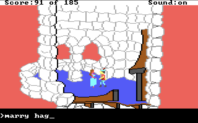
It is interesting to see how similar terms are grouped together so the game logic has an easier time understanding what is being intended. In King's Quest 2, a number of terms and names for female characters are grouped together. This means that Hagatha, Valanice, maiden, woman, grandma, mermaid, little red riding hood, girl, and hose bag are all equally recognized, even if the actual context in the game is not correct. So you can say kiss valanice while in Hagatha's cave, or say marry hag while in the Quartz Tower (probably not a good way to start off the marriage, Graham!).

References
9th June 2018 | 33 RPM

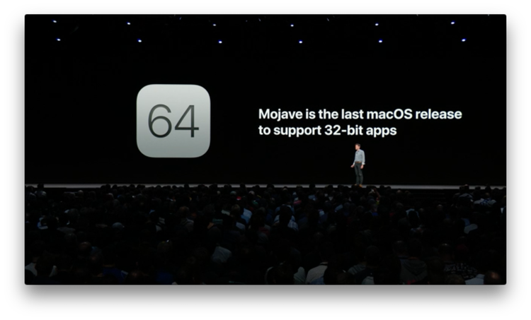
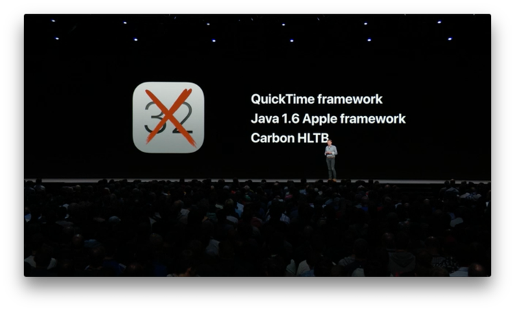
In this year's Platforms State of the Union at WWDC18, Apple reiterated that they are deprecating support for 32-bit Mac apps and frameworks and will fully stop supporting them after macOS Mojave. Apple explicitly showed on a presentation slide that their aging Quicktime framework is one of the casualties, which is a vital piece for 33 RPM to function.

Apple also hinted at something they are working on where they will bring over certain elements of the iOS UIKit framework to the Mac sometime next year, which might aid in the ability to more easily write apps which can run on both the iOS and Mac platforms. We have only been given a brief acknowledgement that this is in the works, but we likely won't have any concrete details for at least another year. Yet, it entices some interesting ideas.
As I mentioned in an earlier post, I've entertained the idea of making an iOS version of 33 RPM to supplant the horrid native Music player, so if I do rewrite this app, it might be useful to wait and see what the Mac version of UIKit brings, so I might be able to support multiple platforms.
If the promise of the cross-platform UIKit does pan out, it still will require a heavy investment of time and effort to update 33 RPM to work with the modern frameworks. These are merely ideas I'm considering at this point, but for now, 33 RPM should continue to run on macOS for at least the next year without any major issues.
References
1st June 2018 | Permanent Eraser
Permanent 2.8.0 has been released, which features the ability to delete write-protected files, such as files owned by another user. The system will ask for administrator credentials to use this feature. Due to Mac App Store restrictions not allowing for granting administrator privileges, this version of the app will only be available for download from the Edenwaith website.
This is the version of Permanent Eraser I have been looking forward to for a long time. With this release and the recent addition of the Erase Free Space Automator action in Permanent Eraser 2.7.2, two long standing features I (and other users) have wanted have finally been added to this app. A lot of features and improvements have gone into Permanent Eraser over the years, and this is the culmination of all of the major features I wanted to include in Permanent Eraser 2.
The Future of Permanent Eraser
Aside from any patches, this is expected to be the last major release for the Permanent Eraser 2.x line. It's been a fourteen year long trek from the initial release of Permanent Eraser 2.0 in April 2004 to today's version. There have been numerous changes in the world of computing since then, but none of have affected Permanent Eraser as much as the change from mechanical hard drives to solid state drives (SSD). It's time for a change.
The first fledgling ideas for Permanent Eraser 3 emerged in 2007, and the next incarnation formed in 2014, so the ideas on how to reimagine Permanent Eraser have been floating around for a number of years. Permanent Eraser was made to securely erase files on hard drives, but that need has declined precipitously over the years, but it leaves open the possibility of solving some new, interesting problems which have arisen over the past few years. There are a number of intriguing ideas I'm eager to explore with the next version of Permanent Eraser.
Permanent Eraser 3 will be a massive rewrite and require an extensive amount of time and effort, so I do not expect the next version to be released for at least a year or more. Permanent Eraser has long maintained an extensive backwards compatibility with older versions of the Mac operating system (PE 2.8 is still works on PowerPC Macs!), but that legacy support will be dropped and PE 3 will likely require at least OS X Yosemite as it makes use of more modern features and capabilities in current hardware and software.
Permanent Eraser 2 has had an amazing run with thousands and thousands of users, and this has become one of my favorite projects I've developed. I look forward to see where I can take this app in the future.
21st May 2018 | Programming
After three years, I have finally been able to upgrade the system software on my HTC One M7 (HTC6500LVW) phone from Android 4.2.2 to 5.0.2. I had previously used a Google Play version of this same phone before at a previous job and had encountered no problems in upgrading the operating system to 4.4 KitKat (which was the most recent version of Android at the time). However, whenever I tried to upgrade my current phone from its stock 4.2.2, there was no response. I looked into what it would take to try and upgrade the phone to Lollipop manually, but directions were confusing and inconsistent, often reliant on which carrier the phone was tied to, as well. One thing might work for GSM phones, but not for CDMA phones, et cetera. It was beginning to look like I would need to bypass certain securities and then root the phone before being able to upgrade the software. It shouldn't have been so complicated.
Oddly enough, it was when I was trying to restore an iPhone 5S back to factory settings did I stumble across the solution to be able to upgrade my Android phone, as well. I was erasing and then restoring an older iPhone for testing purposes, but one glitch I encountered was a SIM card needed to be in the device to properly finish the setup process. This iPhone was originally set up on AT&T, but I had a Verizon SIM card available for a similar model of phone, but that did not work, unfortunately. However, I did have a number of other older phones which had originated on AT&T. I first tried the SIM card from an iPhone 4S, but it was larger than the SIM card found on the iPhone 5/C/S models, but I then noticed it was the same size as the SIM card required in the HTC One, which did not have a SIM card since I had purchased the phone from a fire sale clearance.
Curious, I put the AT&T SIM card into my Android phone, which was set up for Verizon. Considering the earlier failure trying to set up the AT&T iPhone 5S with a Verizon SIM card, there were no expectations that this would work, but it was worth trying, at least.
Previous attempts to check for available software upgrades had always failed. I was pleasantly surprised to find that once the phone had a SIM card present that it was able to find software updates. The entire process took several hours since the phone had to upgrade to each to each iteration (Android 4.3, 4.4, 5.0) before stepping to the next version, plus updating any new software that was made available with each update.
All these years I had investigated convoluted methods to upgrade the software and the ability had been available to me all of these years. (sigh). All I needed to do was add the SIM card and it was ready to go.
19th May 2018 | Edenwaith
Welcome to the fifth iteration of the Edenwaith blog. The original incarnation started as a development log with many small updates (micro-blogging years before Twitter was even started) with a couple of longer form posts interspersed. The second version of this blog was a short lived WordPress blog. I did not care for the lack of the visual customization so it would properly match appearance of the rest of the Edenwaith site, and the performance was horrendously slow, so I quickly replaced the WP blog with my own custom solution, which mixed PHP and RSS. In 2011, the blog migrated from using an XML file to a database to help correct several issues.
Which brings us to today. In the efforts to revamp the entire Edenwaith website, the blog has been relocated to a more memorable www.edenwaith.com/blog URL, improved responsiveness for different screen sizes, and pagination so the entire blog isn't crammed into a single page. In determining the best way to go about implementing pagination, it was nice to see that my ideas were pretty much spot on with what others have recommended in their own approach. It's encouraging to see that after 20+ years of programming that I'm getting the hang of this from time to time.*
* This is intended as a very tongue-in-cheek statement with an included sly wink and grin. Programming can be a very rewarding and daunting endeavor, but it is notoriously difficult and frustrating at times, so programmers love to celebrate their victories, no matter how minor or major.
7th May 2018 | Tutorial

Last year, I took on the arduous task of archiving around 200 old floppy disks. The last time I had done an archive was back in the late 90s, so it was a good idea to go through this process while there was still the necessary hardware available to back up these old relics of digital storage.
Most of my floppy disks were 720K or 1.44MB disks for the PC, with a handful of 800K Mac formatted disks. Since I haven't owned a computer with a floppy drive in it for many years, I went in search of an external floppy drive that would be able to read both 720K and 1.44MB disks. I found a number of products like this which claimed to work with 1.44MB disks, but most products were not very clear if they did or did not work with the older 720K format. Buying a drive off the internet and hoping that it would work with 720K disks was a bit of a gamble. User comments were varied in how reliable these drives would be with the disks.
I visited a Micro Center and they had two types of external USB floppy drives available. One of the drives was in a nondescript, tan cardboard box that was easy to open up. This drive is similar to the package I picked up at Micro Center for around $15 USD (just without the IBM logo). Disk Utility identifies this as the Y-E DATA USB-FDU (USB floppy disk drive). The back of the drive identifies as a Model: FD-05PUB.
The Micro Center staff was accommodating to let me try it out and see if my 1.44MB and 720K disks worked on Mac and/or PC. The Mac didn't initially seem to have any luck with the 720K disk (I later discovered that particular disk was probably dead, since Windows couldn't read it either). But Disk Utility did see the 1.44MB disk appear. When I went over to a PC (running Windows 7), it was able to see both the 1.44MB and another 720K disk which did work.
At home I tried another experiment and hooked the drive up to an older iMac running Snow Leopard. It was able to see any functioning disk I used (both 1.44MB and 720K). I was able to create a disk image off of a floppy, as well. One sad reminder about this relic of a technology — it's slow! Fortunately, even though some of these disks were well over 25 years old, they were of a higher quality than the floppies made in the late 90s (which tended to be a whole lot less unreliable). Of the 200 disks I archived, only about 1 in 10 had any major issues (compared to the Zip disks I also tried to back up, and nearly every one of them was dead or in the process of dying). Of those few floppies which had some bad sectors, I was still able to recover some of the contents by using the command line utility dd.
sudo dd bs=512 if=/dev/rdiskXX# of=/path/to/foo.dmg conv=noerror,sync
In this example, rdiskXX# represents the path to the floppy disk, and it then scrapes the drive and dumps the readable content to a disk image. Use Disk Utility to get the /dev/rdisk path for the floppy drive. This was a welcome workaround to try and partially recover some files, versus having to throw away the entire disk.
800K Mac Floppies
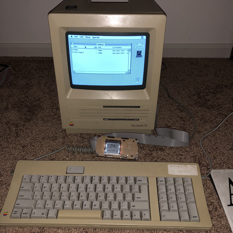
This USB floppy drive did a great job in reading the PC-formatted disks, however it was not able to read the 800K Mac-formatted disks I had. Unfortunately, the Macs of the 80s and 90s which wrote out to 400K and 800K disks used a variable speed head, which allowed a little more data to be written to the disks, versus a PC-formatted disk. This also leads to that PC floppy drives cannot read these disks. The SuperDrive was introduced in 1988, which could also work with high-density 1.4MB floppies. I have a Macintosh SE, but it is the 1987 model, which predated the addition of the SuperDrive (which didn't happen until 1989). If my Mac had been equipped with a SuperDrive, backing up and archiving the Mac floppies would have been relatively simple by copying the contents of the original Mac floppies to the Mac and then copying the contents to a 1.4MB disk and then carrying that over to a modern system for backup. No such luck here, so I needed to find another way to be able to transfer the data from the 800K floppies to a modern computer.
One option to extract the data off of an old floppy is to use a service like RetroFloppy. This is a good option if you have some old floppy disks, but don't have a way to read them. RetroFloppy can handle pretty much any old type of magnetic storage, including Atari, Amiga, Commodore, TRS-80, CP/M, IBM-PC, Apple II, etc.
Some people have taken the route to purchase networking equipment and connect an old Mac up to an AppleTalk network, which might involve a not-quite-as-old Mac, and then transfer the files that way. I did make use of extra hardware, not by networking, but by emulating a floppy drive.
Floppy Emu
The route I took was to purchase a Floppy Emu from Big Mess O Wires, which acts as an emulated floppy drive. You can buy just the hardware, or get a bundled kit, which includes an clear acrylic enclosure. The acrylic has a paper adhesive on it which can be peeled off, but I was too impatient to try and peel off the paper and just assembled the kit as-is.
Configure for Mac
Once I had assembled the Floppy Emu, I still had one more step to perform to get it to work with my Mac SE by downloading the Macintosh firmware (version hd20-0.7H-F14.5 as of this writing). If you are working with an Apple II or Lisa, other firmware needs to be installed. The following are the instructions on how to install the firmware for the Floppy Emu:
See https://youtu.be/Gqpn9ugO1_U for a video demo of the firmware update process.
This update consists of two parts. You need to install both parts! If you see a warning message about "wrong CPLD", it means you haven't installed both parts.
SETUP
- Copy the files firmware.xvf and femu.bin to the root directory of your SD card
- Insert the card into your Floppy Emu, and turn on your computer.
PART 1 (CPLD firmware):
- Hold down the NEXT and PREV buttons.
- Press and release the RESET button.
- Continue holding NEXT and PREV until the firmware update process begins (about 3 seconds).
- Wait 10-15 seconds for the process to complete. Status LED will be flashing.
- When finished, the LCD will display "RESULT: SUCCESS"
At this point, you may see a "wrong CPLD" warning. This is normal.
PART 2 (AVR microcontroller firmware):
- Hold down the SELECT and PREV buttons. Note these are not the same buttons as for part 1.
- Press and release the RESET button.
- Continue holding SELECT and PREV until the firmware update process begins (about 1 second).
- Wait 5 seconds for the process to complete. Status LED will be flashing.
- When finished, the LCD will display self-test information, and the main menu.
Confirm the new firmware version number is displayed on the self-test/info screen during startup.
Load up blank disks and software
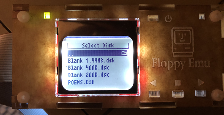
The Floppy Emu comes with a variety of software titles preloaded and it also includes a couple of "blank" disks in several sizes (400K, 800K, and 1.4MB). Since the Mac SE does not know how to handle high-density disks (1.4MB), I could only make use of the 400K and 800K disks. By mounting these disks, I was able to copy my original files to these blank disks, which are then stored on the Floppy Emu's SD card. If one needs additional blank disks, they can be downloaded and then copied onto the SD card for additional spare "disks".

Connect and transfer
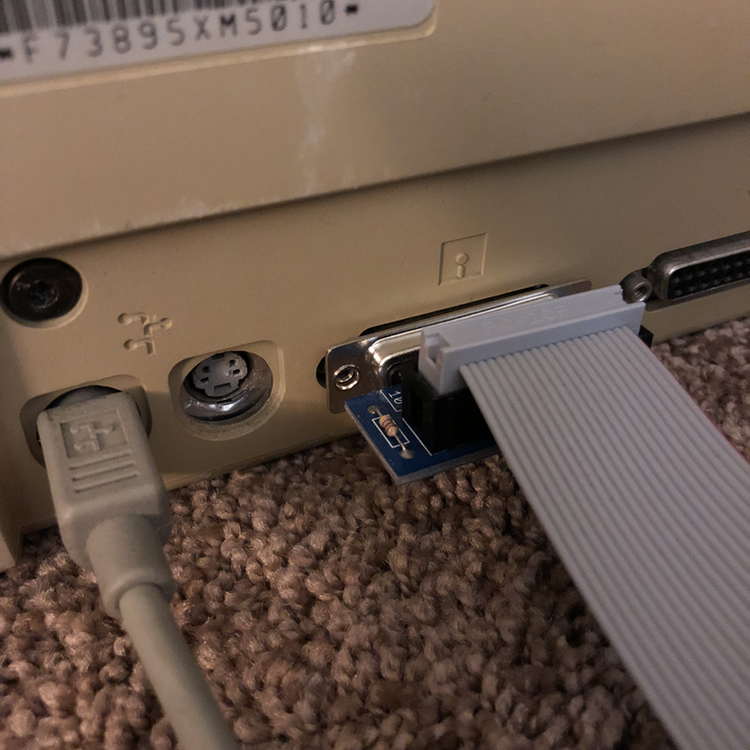
The Floppy Emu uses an SD card, which makes it possible to transfer data between an old Apple computer and a more modern machine. I connected the Floppy Emu to the back of the Macintosh SE. Once the Mac had started up, I selected a "blank" disk from the Macintosh section on the Floppy Emu, which then displays either a 400K or 800K emulated floppy disk on the Mac SE (the 1.4MB blank disk will not load on an older Mac SE). From this point, I was able to copy the files stored on the Mac over to the emulated disks. The Floppy Emu comes with a couple of these blank disks, but if more are needed, then download the blank disks and load them onto the SD card on a modern computer. Once the files have been copied over, eject the Untitled disk by dragging it to the Trash. Shut down the Mac and then move the SD card over to a modern computer. Unfortunately, the blank disks are stored as a DSK image, which cannot be natively ready by a modern Mac, so additional steps are needed to access these stored files from a modern Mac.

macOS and DSK Images
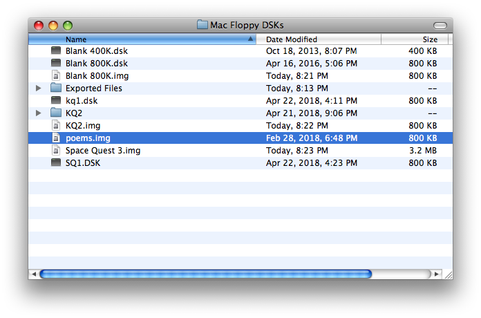
While modern versions of the Macintosh operating system (macOS High Sierra as of this writing) cannot open DSK images, there is an easy work around. Rename the DSK extension to img, and macOS should be able to open the renamed disk image. If you just want to get the files off of a DSK image, this is the simple method. If you want more complex ways of working with DSK images, you'll need to make use of another program such as Mini vMac or HFVExplorer for Windows.
Thanks go out to Steve from Big Mess O Wires for this tip.

Set Up Mini vMac
- Download Mini vMac. For a new Mac, download the x86-64 build for Macintosh.
- Mini vMac is not code signed, so right-click on the app and select Open. At the dialog box, click the Open button.
- Get a ROM image and place it in the same folder as Mini vMac (vMac.ROM). This is one of those sticky legal issues where you should have an old Mac and then extract the ROM image from it to make a legitimate copy of the ROM. Or you can search the internet. This part is left as an exercise for the reader.
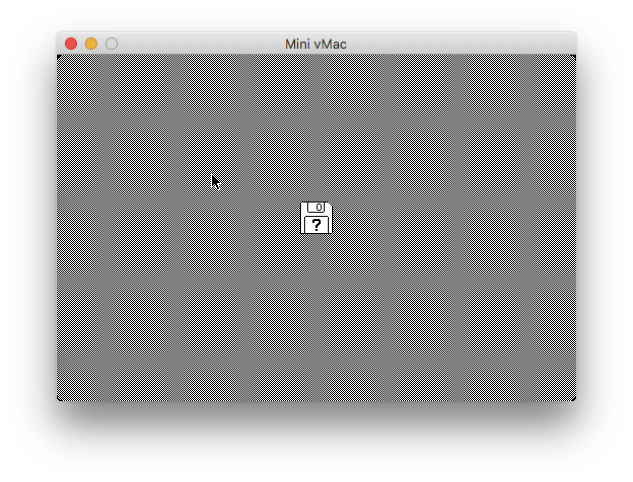
- Once vMac.ROM is in the same folder as the Mini vMac app, start Mini vMac. You will get a start up screen with a disk bearing a flashing question mark. You will need a bootable disk image. Download the file MinivMacBoot.dsk and drop it on the screen to “launch” vMac.

Transfer Files from Mac to Mini vMac
It would be great if there was a straightforward method to open up the old DSK images and transfer files to and fro, but it is not nearly that simple. This is where Mini vMac comes in. Take out the SD card from the Floppy Emu and bring it over to a modern computer to access the DSK images.
Export Files From Mini vMac
Even once I had my files loaded up on the Floppy Emu's SD card, I had to find a way to get those files transferred to a modern computer. When the SD card is plugged into a modern computer, it displays a bunch of DSK images, which are not natively handled by macOS. This is where Mini vMac is necessary. Start up vMac and then load the DSK image with the files to mount the disk in vMac. I was able to see the files in vMac, but how would I extract the files from the DSK and loaded onto my Mac? This is where ExportFl comes in, which can take these files in vMac and export them one at a time to the host system. Since I had a quite a few files, I just archived them using StuffIt Lite 3.5 in vMac and then exported the .sit files to my Mac.
To use ExportFl, download it, then mount the ExportFL DSK into vMac, which appears as a disk. Launch the ExportFL application, then select File > Open. Select the file to export and then you will be prompted with a native file dialog window to tell vMac where to export the file.

Import Files To Mini vMac
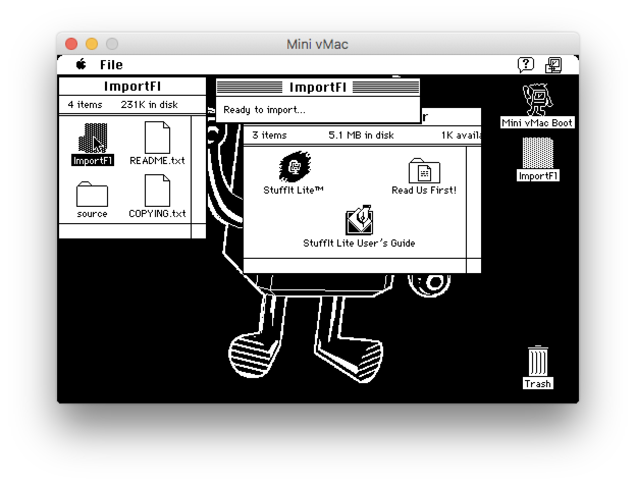
We've now learned how to export files out of Mini vMac, but what if we have some files we want to import and save onto a DSK image or use directly within Mini vMac? There is ImportFl, very similar to ExportFl, except it allows Mini vMac to import files from a modern Mac. Download, ImportFL, unzip the file, mount the ImportFl DSK in Mini vMac, start the app up, and once the dialog box is on the screen, drag and drop files onto Mini vMac's window. This can be useful if one wants to take some files from a modern computer and move them to an older Apple computer.

Reading Old Files
Microsoft Word
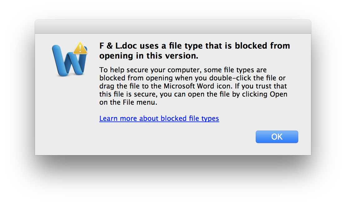
The original documents were likely created with Word 6.0. Trying to open these documents using a more recent version of Word (in this case, Word 2011), a warning dialog appears about opening old files, but they can still be opened by selecting File > Open. For such an old file, Word was able to read them properly. If you are using an older version of Word (e.g. Word 2004), no such alert dialog will appear.

ClarisWorks/AppleWorks
For any old ClarisWorks documents, AppleWorks can open and read those. If you have a Mac OS X installer of AppleWorks 6.2.9, it is possible to read these old documents on a not-completely-ancient Mac. I have a PowerBook G4 (running Mac OS X Tiger and Leopard) which has applications such as AppleWorks and Word 2004 on them.
Other Formats (HomeWord II, etc.)
For those file formats which have not persevered over the decades, some can only be opened with equally ancient programs, but sometimes they can be converted to a more modern or universal format. Many of the original documents I wrote on a Tandy 1000 HX computer were created with either DeskMate or Sierra's word processor Homework II. HomeWord II has a mode to export its files to ASCII, but it is also possible to open up the original files using a text editor of your choice. There is a lot of interspersed formatting, but it is legible, whereas if the file had been saved as a binary blob, the file might not be so easily translated/read.
Conclusion
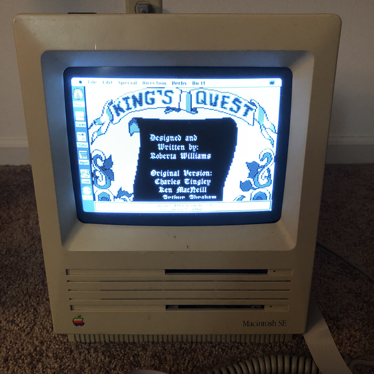
Learning how to back up and transfer the data from some old 800K Mac floppy disks has been an interesting process, which had the additional benefit of getting a little extra use out of a 30 year old Mac by playing a couple of old Sierra games such as the original King's Quest and Space Quest games. I hope that this proves to be useful for someone who might be encountering a similar issue or just might want to get a little more life out of some beloved dinosaur technology. Many thanks go out to Big Mess O' Wires and Grphyel for all of the work put into developing Floppy Emu and Mini vMac.

21st April 2018 | Programming
With the release of macOS 10.13.4, Apple is now actively warning its users that any 32-bit software may not be fully compatible with future versions of the Macintosh operating system. This does not come as too much of a surprise since we recently underwent this forced transition from 32 to 64-bit software in iOS. 64-bit Intel processors, starting with the Core 2 Duo, have been available in Macs for well over a decade, but it is only now that Apple is "encouraging" that all modern software should be run as 64-bit. Fortunately, a casual perusal of what software is 64-bit shows that most software has already made the transition. Only older software and deprecated frameworks have not been updated. This includes even Apple's own QuickTime framework, which has been replaced by the newer AVFoundation framework.
From Apple's 64-Bit Transition Guide:
Beginning in OS X v10.5, most OS X APIs are available to 64-bit applications. Going forward, Apple plans to make new APIs 64-bit-compatible unless otherwise noted. However, not all existing 32-bit APIs are supported in 64-bit applications. ... In certain technology areas (Carbon particularly), a few APIs have been deprecated for 32-bit use beginning in OS X v10.5. Most of these APIs are not available in 64-bit applications.
Back in 2007, Apple notified developers that it would not be updating the Carbon framework to 64-bit. Considering that a few bits of Permanent Eraser still rely upon Carbon, I was concerned that Permanent Eraser would break in the future due to Carbon. The good news is that "Carbon" acts as more of an umbrella term, and some of its various functionality fall under other frameworks (such as Core Foundation or Core Services) which have been updated to 64-bit. However, in my research, I did come upon some older methods I've used have been deprecated over the years, so it was still a useful exercise to look for more modern alternatives.
I created a small example program which details several methods to determine if a select file contains a resource fork (or not), and if so, determine the size of the fork. Early methods depended on methods such as FSGetCatalogInfo, which was deprecated several years ago in OS X 10.8 Mountain Lion. Even if some of these deprecated methods still work on a 64-bit system, it is a good idea to update them with more modern methods to protect against the case that these methods might break in the future since they are no longer being maintained.
This coding example examines four different methods: getxattr, NSFileManager, getattrlist, and FSGetCatalogInfo
getxattr - This is the most straightforward method I discovered, and it works well on older systems, as well.NSFileManager - By appending ..namedfork/rsrc to the end of a file path, one can inspect a file's resource fork (if it exists). This naming scheme could change in the future, so this may not be the most reliable method.getattrlist - This was mentioned on some message boards and mailing lists, but like in my free space example from last year, I was never able to get getattrlist to work properly.FSGetCatalogInfo - This is the "old" way to inspect a file's data and resource forks. It still works as of High Sierra, but several of the methods used in this example such as CFURLGetFSRef and FSGetCatalogInfo have been deprecated.
References
25th March 2018 | Website
Today marks the unveiling of the fourth major iteration of the Edenwaith website. This is an important milestone for the Edenwaith website as it adopts a responsive design for both desktop and mobile web browsers and finally strips away the last remnants of ancient table-based layout. Some of the oldest pages of the previous iteration dated as far back as 2005. The website was far, far past due for a refresh.
The website has slowly evolved since the last major version by eschewing older design methods and adopting newer technologies such as HTML5 and CSS3. Revamping the entire website was a good opportunity to rethink the design, layout, and content, which included stripping some ancient content such as the tutorials and product pages for retired apps.
When I first began doing web design, it was not uncommon to see a footnote on a site recommending that the site looked best on a screen with a minimum resolution of 640x480 or 800x600. One of the biggest shifts in web development over the past nine years has been the rise of mobile web browsers on phones and tablets. A web designer can no longer assume that their content will be viewed on a large desktop monitor, but instead, will likely be viewed on a smaller display limited to several inches along the diagonal.
Adopting a responsive web design was the top priority for Edenwaith 4.0. But with all of the changes which have occurred with the rise of mobile devices, where does one start to learn how to adopt these new methodologies? It initially seems like designing for multiple screen sizes can be daunting and complicated, but it pretty much all boils down to one bit of useful CSS: @media screen and (max-width: 450px)
By being able to dynamically detect the size of the screen's viewport, it allows the page to resize and reposition its content, much in a similar manner to how Adaptive UI handles the interface for iOS. With some careful design, a site can look and work well with all sizes of screens. In learning responsive web design, I read through Ethan Marcotte's book Responsive Web Design and Interneting Is Hard's article on Responsive Design, topped with some neat CSS animation tricks from the W3Schools website.
References

